 Today I went to look find something on Mary McDonald's website and was pleasantly surprised to find that her entire site has been re-vamped and upgraded. Her new site is easy to navigate and filled with new photographs of her beautiful interiors. McDonald, a Domino Magazine darling, has long been one of my favorite designers. Her style is glamorous and sophisticated yet classic and understated. Be sure to check out her new site here.
Labels: Interiors
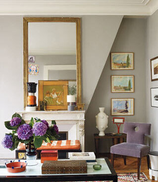
 As a young girl, purple was my favorite color. I will never forget my purple clogs and matching purse that my aunt gave me for my 4th birthday. Since those early days, I have gravitated away from this complex hue. The design world has been awash in purple for the last year and a walk through your local department store will remind you that this violet isn't shrinking anytime soon. While I am still not ready to embrace the shade, I am starting to think a gray-tinged lilac or a rich aubergine here and there could be pretty...


{images: 1- via town and country, august 2009; 2- design by hal williamson via house beautiful; 3- via the sartorialist; 4- via architectural digest; 5- design my emma jane pilkington via elle decor}
Labels: Interiors

A good friend was over helping me make beds and unpack boxes. After a good bit of wrestling mattress pads onto my sons' bunk beds we ended up sitting and visiting for a brief time in our new large family room. As friends who have a love for design design often do, we ended up batting around ideas for furnishing the room.
Because the space is so large we will need a pair of sofas, back to back in the middle of the room and two separate seating areas on either side. In addition, to the two seating areas there is a large bay window off to the side which needs to be filled as well. I had thought a third smaller seating area, such as two chairs and a small table might be appropriate, but my friend had an even better idea: a game table. A place for games to be played and puzzles to be put together is perfect for our big family and makes our house more of a home. So now, I am in search of the perfect game table. On a limited budget I will be scouring consignment stores and flea markets to find the perfect little perch for our budding strategists!


{images: 1- design by marshall watson, house beautiful; 2- design by miles redd via house beautiful; 3- via 1st dibs; 4 - via mecox gardens}
Labels: Interiors
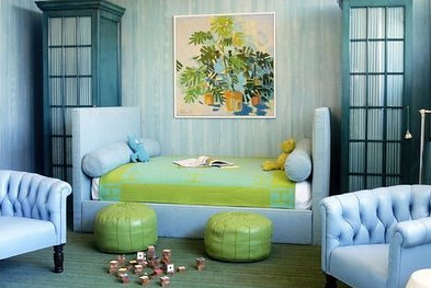
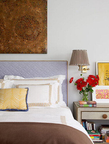
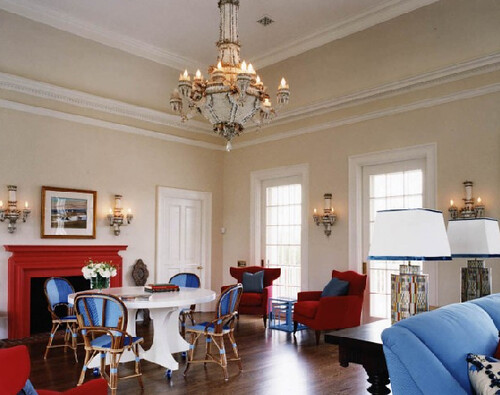
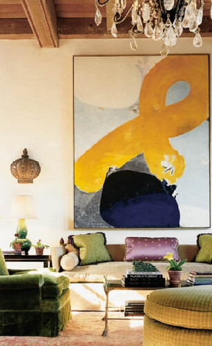
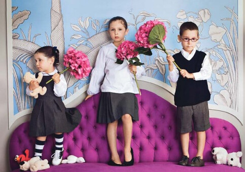
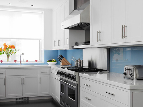
Color is making a comeback both in the fashion and design world and not a moment too soon. A good dose of color is in order this time of year. As of late, vibrant blues and lavenders are catching our eye. Some call it bold, but we call it therapy.
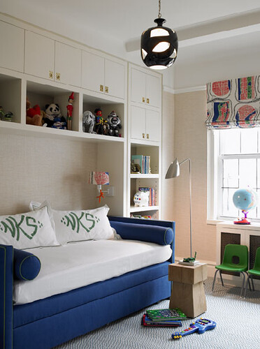
Labels: Interiors
 katie leede
I have two boys of my own and up until now, decorating their room has been low on my priority list. It's not for lack of desire that their room has been neglected but rather it is just that other rooms have just taken priority in the time an budget categories. Recently, my seven year old son, Sam, asked me to "re-decorate" his room.
Children's rooms, espeically boys', can be tricky. You want something that they will appreciate and enjoy today as well as suit them for years to come. As children get older they tend to have opinions of their own as to what they do and do not like. While I will have the final say in our home (no, we can't have Star Wars bedding), I do want my boy's opinions on things like color scheme, fabric, wall hangings and accesories. Afterall, in the end I want the room to reflect the essence of who my boy's are.

A classic blue white and red pallete is a perennial favorite among designers. These colors seem to say "boy" and are not ones you or they will tire of easily. This patriotic classic room, with drum chandeir would best be suited for a young boy who is ready to move out of his nursery.


Anna Spiro, of Absolutely Beautiful Things recently did a beautiful job re-decorating her elementary school-aged son's room. She stuck with the classic pallette and gave it her own flair with vintage, nautical accessories. I think this is a room he will enjoy for many years to come.


Steven Gambrel always creates refreshing rooms for boys. His clean, classic, elegant sensiblities are perfect for a project like this. His rooms always look youthful, but do not come across as juvenile or cute. I am inspired use of neutral colored maps as wall coverings in the room above. Surrounding children with maps gives them a bigger sense of the world in which they live and hopefully will give them a desire to travel and explore.

Bunk beds are a necessity in our home. With four little ones and friends who come to spend the night the more beds the better. One of my all time favorite boy's rooms comes from Tory Burch's Manhattan apartment. We recently purchased a bunk bed similar to Burch's. It has simple lines that remind me of old school camp bunks. The ticking stripes on the wall combined with the nautical ship lights complete the look.


Aerin Lauder's sons' rooms offer vibrant, coloful, contemporary examples of boys' decor. The first bedroom is swathed in Quadrille's iconic Alan Campbell Zig-Zag fabric and is accesorized with a colorful vintage movie poster as well a yellow surfboard which co-ordinates with the traditional Leontine Linens bedding. The cobalt blue room is a great example of how great design can incorporate our children's toys and special collectibles. The Blu Dot table at the foot of the bed (which I might just have to purchase!) displays a toy Yoda and Incredible Hulk as well as other keepsakes that her son holds dear. Often we think of our children's toys as distractions to great design but in this case I think it only enhances it.
Hopefully this weekend, Sam and I can find some special time to pour over these and other great boys' rooms. It will be fun to hear what he does and does not like. I will be sure to keep you posted...
{images: 1- katie leede via habitually chic; 2- steven gambrel; 3 & 4- anna spiro via absolutely beautiful things; 5,6 & 7- steven gambrel; 8- photo from Vogue; 9 & 10 - photographed by simon upton for elle decor}
Labels: Interiors
 I have always loved topiaries. Their clean, simple forms adds a dash of lively elegance to any space. They work equally well in rustic county spaces as they do in modern streamlined ones. Alone, they are dainty and delicate and grouped together in mass they create a fabulous scene. I would love to have some around our new home to bring life indoors during the winter months. It would be lovely to grow and prune them myself, but my children are my garden these days so I think I will be buying some at the local flower shop.


{images: 1- via this is glamorous; 2- via eddie ross; 3- via veranda october 2009; 4- via veranda october 2009; 5- via nestegg; 6- via bluehydrangea}
Labels: Interiors

I have wallpaper on the brain as I continue to work on my home. If I could, I would paper or upholster a good portion of this house! One of my favorite sources for wallpaper is Farrow and Ball. These beautiful English papers come in many different colorways allowing each pattern to have many different looks. If I had to choose a favorite F & B paper is would be this gloriously classic Silvergate damask.
 I love tradition with a twist, so personally I prefer this paper in a fun, bold color way or mixed in with more contemporary furnishings. Russian textile designer Olya Thompson's Brooklyn Brownstone features Farrow and Ball's Silvergate in a ravishing blue. It is a perfect backdrop in her richly textured home.
Another stylish woman, designer Jane Whitfield, who operates as the right hand woman to Marc Jacobs at Louis Vuitton, also chose Silvergate to adorn a soft, pretty bedroom in her home located in a west village of Versailles.

The paper in a graphic chocolate and white with co-ordinating chocolate trim.
 Miles Redd uses the wallpaper in this contemporary study. In true Redd style, this room is a great mix of old and new.
 Here is a more traditional use of the Silvergate in the master bedroom of Country Living's 2008 House of the Year. The soft but bold pattern pairs nicely with pretty pale bedding.
{images: 1 via farrow and ball; 2- photographed by francois halard, vogue january 2010; 3- via telegraph; 4- via farrow and ball; 5- photographed by simon upton for elle decor; 6- via country living}
Labels: Interiors
 If you haven't noticed yet, I am a big fan of stripes. They are handsome, timeless and add a dramatic punch to an interior. Since I don't often gravitate towards florals, I often turn to stripes to add depth, interest and texture to a room. Lately, I have been taking note of rooms with horizontal stripes. Vertical stripes are much more traditional and tailored. Rooms with vertical stripes tend to look elongated and tall, so for spaces with lower ceilings, they are best. Horizontal stripes, on the other hand, gives a space a more relaxed and casual air and are often associated with more contemporary or transitional interiors. Horizontal stripes make a space feel open and wide so they are great to use in narrow hallways and small rooms.
 One can see how small narrow spaces benefit greatly from the use of horizontal stripes, in the picture of the butler's pantry above and the entry hall below. In the top image, Paula Caravelli uses a bold chocolate and off white stripe to tie her butler's pantry into her contemporary, dark brown dining room.
 This hall would feel claustrophobic without the horizontally striped Osborne and Little wallpaper. I love the juxtaposition of the more contemporary wallpaper with the traditional antique furniture.
  Sara Gilbane opens up this small entry way with a single horizontal stripe using a custom embroidered Holland and Sherry Fabric. It's simply gorgeous!
 The bold striped walls take center stage in this contemporary beach house living room designed by Mary McDonald.
  Miled Redd uses horizontal stripes in this more subtle seaside living room. The stripes serve to widen the small sitting are and bring a contemporary, nautical feel to the space.
 I came across this fabulous water-stained blue striped Larsen wallpaper on a recent trip to ADAC. It would make a gorgeous, modern statement in a small powder room.
  This cozy but quite formal sitting area can be found in the famous London antique store, Guinevere. I included this image to show that horizontal stripes can be used beautifully in a traditional manner as well.
 This entryway, by Amanda Nisbet, is simple yet stunning. Without the horizontal stripes the space would fall flat.
 So tell me are you a fan? Is there a nook in your home that is calling to be striped sideways?
{images: 1- via elle decor photographed by simon upton; 2- via house to home uk; 3- via sara gilbane interiors; 4- via hygge nook; 5- via alicia b.designs 6- author's own; 7- via all the best; 8- via la dolce vita}
Labels: Interiors